
Mar 24, 2022
A Dashboarding Tool with Bird API:er
För nästan ett år sedan skrev Tom Mairs, Bird:s chef för kundframgångar, ett mailer-verktyg som använder Bird API:er. I det här inlägget tar jag vid där han slutade. Hans verktyg möjliggör tidsstyrd överföring av jobb, men vad händer om vi vill skapa våra egna instrumentpaneler och händelseloggar?
Perhaps I want to create a specific dashboard for a business group or a customer-facing dashboard, but not provide users full access till Bird UI. This script just touches the surface of what is possible utilizing Python, Plotly Dash, and våra API:er.
As I began my search online, I wanted to find the path of least resistance. I could have created all the dashboards and UI myself in HTML and python, however, after some Google searching, I came across Plotlys streckkod, which integrates easily with python. I chose Dash for 2 reasons: 1) it is open source, and 2) after reading the documentation it seemed easily customizable for what I was trying to do. Dash är ett bibliotek med öppen källkod som är perfekt för att bygga och distribuera dataappar med anpassade användargränssnitt. This made creating a UI extremely simple. Den question then became, how complex did I want to make this app? Den more time I spent, the more features I wanted to add.
For the initial project, I wanted to ensure that I had a dashboard with customizable metrics and a selectable timeframe. Initially, I started with a dashboard where you could only pick one metric from the dropdown. Then, as I got feedback from colleagues, I refined the dashboard a little bit to add multi-select and axis titles. I also decided to add an additional tab for an events log. I came till point where I was satisfied with what I had as a good starting point for anyone wishing to build out their own dashboards. Of course, I put the project in Github for you to clone or branch.
Att komma igång
To access this app, you will need to ensure you are running python 3.10 or above and install the following libraries:
önskemål
dash
Pandor
Then, input your API key into App.py and run the app. It will run on http://localhost:8050. For further information on deploying this to a public-facing server (such as AWS), see the following resources:
Skapa sidan Dashboard
Initialisera först dataramen och instrumentpanelen. Om du inte initierar instrumentpanelen visas ingen instrumentpanel i användargränssnittet.
df = pd.DataFrame({
"Antal": [0,0],
"Tid": [0,0]
})
fig = px.line(df,x="Tid",y="Antal")
Then, build out the first tab. This is a combination of an app callback (to check which tab is being utilized); along with a conditional function to check which tab is currently selected. The code below builds out only the blank dashboard and UI elements (we will get to the events tab later on). The dcc elements are the Dash grundläggande komponenter and the HTML-komponenter easily allow for HTML to be used in the UI.
html.H2('Instrumentpanel för analys'),
#Multi-select rullgardinsmeny
dcc.Dropdown(['Count Accepted','Count Admin Bounce','Count Block Bounce','Count Bounce','Count Clicked','Count Delayed','Count Delayed First','Count Delivered','Count Delivered First','Count Delivered Subsequent',"Count Generation Failed", "Count Generation Rejection", "Count Hard Bounce", "Count Inband Bounce", "Count Initial Rendered", "Count Injected", "Count Out of Band Bounce", "Count Policy Rejection", "Count Rejected","Count Rendered", "Count Sent", "Count Soft Bounce", "Count Spam Complaint", "Count Targeted", "Count Undetermined Bounce", "Count Unique Clicked", "Count Unique Confirmed Opened", "Count Unique Initial Rendered", "Count Unique Initial Rendered",'Count Unique Rendered','Count Unsubscribe','Total Delivery Time First','Total Delivery Time Subsequent','Total Message Volume'], id="y-axis", multi=True, searchable=True, placeholder="Select metrics(s)"),
#Datumväljare (högsta tillåtna datum sätts till dagens datum) dcc.DatePickerRange( id='date-picker-range', start_date=date(2022,1,1), end_date=date(2022, 2, 1), max_date_allowed=date(datetime.today().year,datetime.today().month,datetime.today().day), ),
#Graph-objekt dcc.Graph( id='Emails', figure=fig )
Note with dash how simple creating a dashboard UI with a multi-select, searchable dropdown is. To disable multi-select or search, the parameters for creating en rullgardinsmeny can be easily modified. I found that the most complex part of this project was building out the actual data frame from inputs, as well as getting the HTML + CSS to work correctly in the UI.
The API för mätning av tidsserier allows for 33 individual metrics to be pulled based on a date/time range. You can filter deeper by Domains, Campaigns, IP Pools, Sending Domains, Subaccounts, and specify the Precision of time-series data. These additional filters along with deliverability analytics could be a future improvement to this project (error catching would need to be implemented for clients who don’t have access to deliverability analytics).
Utilizing and calling the API för mätvärden, I build out a dashboard with the user’s selected parameters and specified timeframe. The initialized dashboard is then updated.
#Build the API call utilizing the parameters provided params = { "from" : start_date + "T00:00", "to" : end_date + "T00:00", "delimiter" : ",", "precision" : "day", "metrics" : joined_values } api_url = BASE_URL + "/metrics/deliverability/time-series" response_API = önskemål.get(api_url, headers = {"Authorization" : API_KEY}, params=params) response_info = json.loads(response_API.text) new_df = pd.json_normalize(response_info, record_path=['results']) value_array = joined_values.split(",") #Build out a new dashboard utilizing the new metrics and dates from the updated API call fig = px.line(new_df, x=new_df['ts'], y=value_array, labels={"value": "Count", "variable": "Metric","ts":"Date"}) fig.update_xaxes(title_text="Time") fig.update_yaxes(title_text="Count") return fig
Följande är ett exempel på flera utvalda mätvärden och en utökad tidsram.
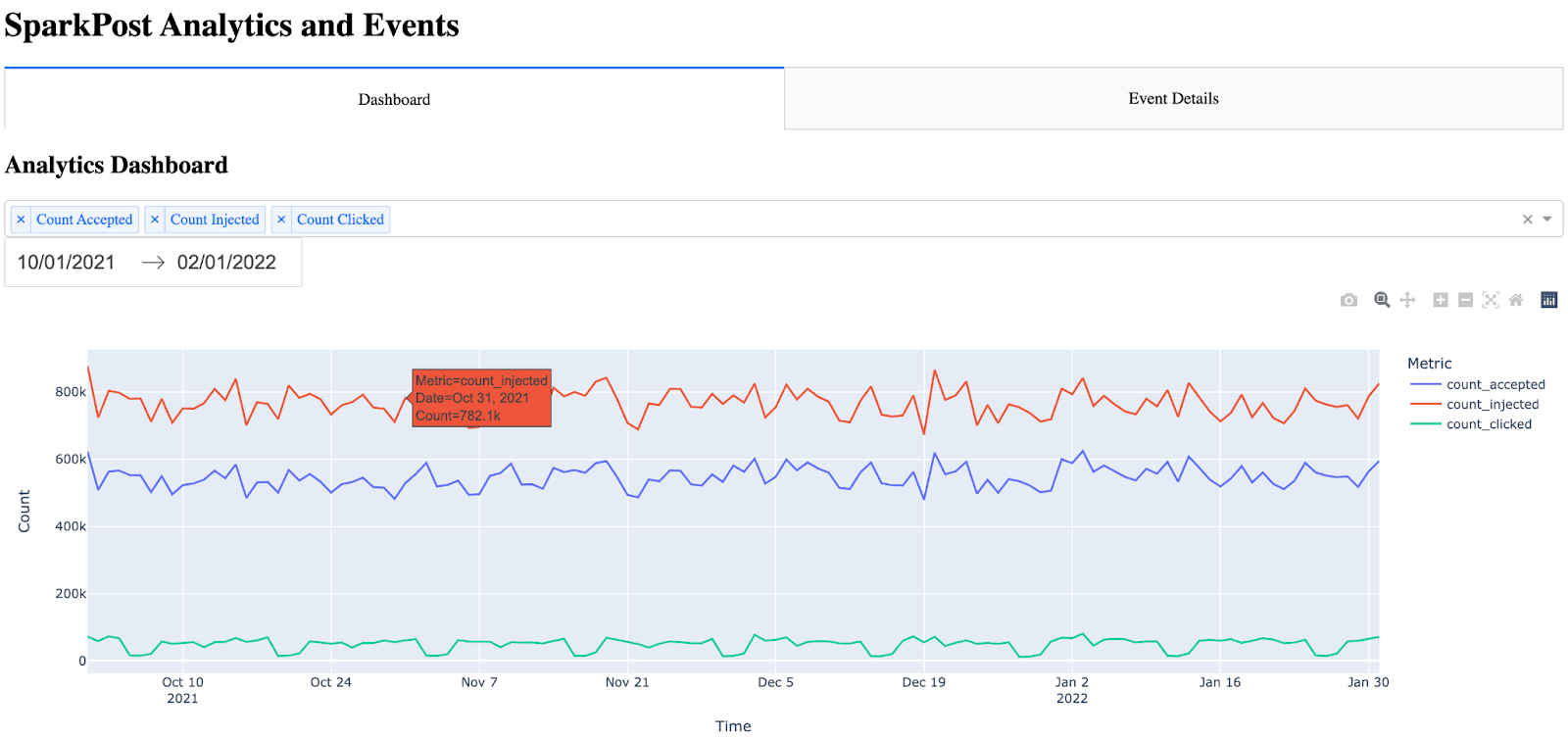
Observera: Det finns många objekt som automatiskt byggs in i instrumentgrafen (hover, zoom, autoscale).
Skapa sidan med information om evenemanget
Sidan med händelseinformation var lite svårare eftersom jag inte visste det bästa sättet att presentera alla händelsemätvärden på ett lättläst sätt. Jag övervägde att lägga till filtreringsparametrar på den här sidan, men jag bestämde mig för att det skulle lägga till en betydande mängd tid till det här projektet eftersom tabellen då skulle behöva vara dynamisk (tillsammans med att lägga till parametrarna, callbacks etc.). Jag bestämde mig för att visa alla händelser och placera tidsstämpeln först (eftersom diagrammet inte var lätt att läsa utan att placera tidsstämpeln först). Inledningsvis upptäckte jag att tabellen var otroligt svår att se med bara den råa HTML-filen. Det fanns inga kanter och inga färgskillnader för rubrik kontra rader. För att göra tabellen mer lättläst kunde jag använda CSS i Dash.
The idea for the event details is almost the same as the dashboard, except this time, I call the API för händelser and bring in all events. Note the event details only shows the 10 most recent events (utilizing the max_rows parameter and API filtering). This can be increased, however, I settled on showing the 10 most recent events because the more events have shown, the longer the API call takes. One significant improvement that could be made would be the ability to paginate and include a Next Page / Previous Page in the UI.
För att bygga upp fliken (sidan) med händelser anropar jag först API:et för händelser och analyserar JSON-svaret till en dataram. Sedan sorterar och ändrar jag ordningen i dataramen så att tidsstämpeln hamnar i den första kolumnen. Slutligen bygger jag upp HTML-tabellen genom att iterera genom dataramen.
#Build out and call the events API params = { "events" : "delivery,injection,bounce,delay,policy_rejection,out_of_band,open,click,generation_failure,generation_rejection,spam_complaint,list_unsubscribe,link_unsubscribe", "delimiter" : ",", "page" : "1", "per_page" : "10" } api_url = BASE_URL + "/events/message" response_API = requests.get(api_url, headers = {"Authorization" : API_KEY}, params=params) response_info = json.loads(response_API.text) new_df = pd.json_normalize(response_info, record_path=['results']) max_rows=10 #Max number of results show in the events table #Place timestamp as the first column in the table new_df = new_df.reindex(sorted(new_df.columns), axis=1) cols = ['timestamp'] new_df = new_df[cols + [c for c in new_df.columns if c not in cols]] #Show the new HTML with the events table (note, this table also references table.css) return html.Div([ html.H2("Event Details"), html.Table([ html.Thead( html.Tr([html.Th(col) for col in new_df.columns],className="table_css") ), html.Tbody([ html.Tr([ html.Td(new_df.iloc[i][col],className="table_css") for col in new_df.columns ]) for i in range(min(len(new_df), max_rows)) ]) ]) ])
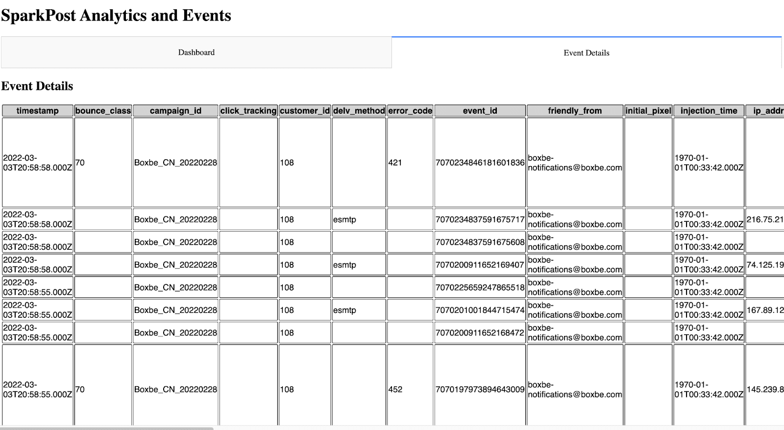
Det ser ut så här i användargränssnittet.
Nästa steg
För någon som vill skapa sin egen instrumentpanel eller händelselogg är detta en bra start. Med den anpassningsbarhet som finns här är det bara fantasin som sätter gränser.
Som diskuterats ovan är några framtida förbättringar som skulle kunna göras följande:
Lägga till leveransbarhetsanalyser i instrumentpanelen
Lägga till fler filter i instrumentpanelen
Möjliga cachningsalternativ så att API:et inte anropas varje gång sidorna ska visas
Förbättringar av användargränssnittet
Lägga till filtrering och paginering på sidan med händelseinformation
I’d be interested in höra all feedback or suggestions for expanding this project.
~ Zach Samuels, Bird Senior lösningsingenjör