
Mar 24, 2022
A Dashboarding Tool with Bird APIs
Vor fast einem Jahr schrieb Tom Mairs, Bird's Director of Customer Success, ein Mailer-Tool unter Verwendung von Bird APIs. In diesem Beitrag mache ich da weiter, wo er aufgehört hat. Sein Tool ermöglicht die zeitgesteuerte Übertragung von Aufträgen, aber was ist, wenn wir unsere eigenen Dashboards und Ereignisprotokolle erstellen wollen?
Perhaps I want to create a specific dashboard for a business group or a customer-facing dashboard, but not provide users full access zum Bird UI. This script just touches the surface of what is possible utilizing Python, Plotly Dash, and unsere APIs.
As I began my search online, I wanted to find the path of least resistance. I could have created all the dashboards and UI myself in HTML and python, however, after some Google searching, I came across Plotly's Dash, which integrates easily with python. I chose Dash for 2 reasons: 1) it is open source, and 2) after reading the documentation it seemed easily customizable for what I was trying to do. Dash ist eine Open-Source-Bibliothek, die sich ideal für die Erstellung und Bereitstellung von Datenanwendungen mit angepassten Benutzeroberflächen eignet. This made creating a UI extremely simple. Die question then became, how complex did I want to make this app? Die more time I spent, the more features I wanted to add.
For the initial project, I wanted to ensure that I had a dashboard with customizable metrics and a selectable timeframe. Initially, I started with a dashboard where you could only pick one metric from the dropdown. Then, as I got feedback from colleagues, I refined the dashboard a little bit to add multi-select and axis titles. I also decided to add an additional tab for an events log. I came zum point where I was satisfied with what I had as a good starting point for anyone wishing to build out their own dashboards. Of course, I put the project in Github for you to clone or branch.
Erste Schritte
To access this app, you will need to ensure you are running python 3.10 or above and install the following libraries:
Anfragen
dash
Pandas
Then, input your API key into App.py and run the app. It will run on http://localhost:8050. For further information on deploying this to a public-facing server (such as AWS), see the following resources:
Erstellen der Dashboard-Seite
Initialisieren Sie zunächst den Datenrahmen und das Dashboard. Ohne Initialisierung des Dashboards wird kein Dashboard in der Benutzeroberfläche angezeigt.
df = pd.DataFrame({
"Anzahl": [0,0],
"Zeit": [0,0]
})
fig = px.line(df,x="Zeit",y="Anzahl")
Then, build out the first tab. This is a combination of an app callback (to check which tab is being utilized); along with a conditional function to check which tab is currently selected. The code below builds out only the blank dashboard and UI elements (we will get to the events tab later on). The dcc elements are the Dash Kernkomponenten and the HTML-Komponenten easily allow for HTML to be used in the UI.
html.H2('Analytics Dashboard'),
#Mehrfachauswahl-Dropdown
dcc.Dropdown(['Count Accepted','Count Admin Bounce','Count Block Bounce','Count Bounce','Count Clicked','Count Delayed','Count Delayed First','Count Delivered','Count Delivered First','Count Delivered Subsequent','Count Generation Failed', 'Count Generation Rejection','Count Hard Bounce','Count Inband Bounce','Count Initial Rendered','Count Injected', 'Count Out of Band Bounce', 'Count Policy Rejection','Count Rejected','Count Rendered','Count Sent','Count Soft Bounce','Count Spam Complaint','Count Targeted','Count Unetermined Bounce','Count Unique Clicked','Count Unique Confirmed Opened', 'Count Unique Initial Rendered','Count Unique Rendered','Count Unsubscribe','Total Delivery Time First','Total Delivery Time Subsequent', 'Total Message Volume'], id="y-axis", multi=True, searchable=True, placeholder="Select metrics(s)"),
#dcc.DatePickerRange( id='date-picker-range', start_date=date(2022,1,1), end_date=date(2022, 2, 1), max_date_allowed=date(datetime.today().year,datetime.today().month,datetime.today().day), ),
#Grafikobjekt dcc.Graph( id='Emails', figure=fig )
Note with dash how simple creating a dashboard UI with a multi-select, searchable dropdown is. To disable multi-select or search, the parameters for creating eine Auswahlliste can be easily modified. I found that the most complex part of this project was building out the actual data frame from inputs, as well as getting the HTML + CSS to work correctly in the UI.
The Zeitreihen-Metriken API allows for 33 individual metrics to be pulled based on a date/time range. You can filter deeper by Domains, Campaigns, IP Pools, Sending Domains, Subaccounts, and specify the Precision of time-series data. These additional filters along with deliverability analytics could be a future improvement to this project (error catching would need to be implemented for clients who don’t have access to deliverability analytics).
Utilizing and calling the Metriken-API, I build out a dashboard with the user’s selected parameters and specified timeframe. The initialized dashboard is then updated.
#Build the API call utilizing the parameters provided params = { "from" : start_date + "T00:00", "to" : end_date + "T00:00", "delimiter" : ",", "precision" : "day", "metrics" : joined_values } api_url = BASE_URL + "/metrics/deliverability/time-series" response_API = Anfragen.get(api_url, headers = {"Authorization" : API_KEY}, params=params) response_info = json.loads(response_API.text) new_df = pd.json_normalize(response_info, record_path=['results']) value_array = joined_values.split(",") #Build out a new dashboard utilizing the new metrics and dates from the updated API call fig = px.line(new_df, x=new_df['ts'], y=value_array, labels={"value": "Count", "variable": "Metric","ts":"Date"}) fig.update_xaxes(title_text="Time") fig.update_yaxes(title_text="Count") return fig
Nachfolgend finden Sie ein Beispiel für die Auswahl mehrerer Metriken und einen erweiterten Zeitrahmen.
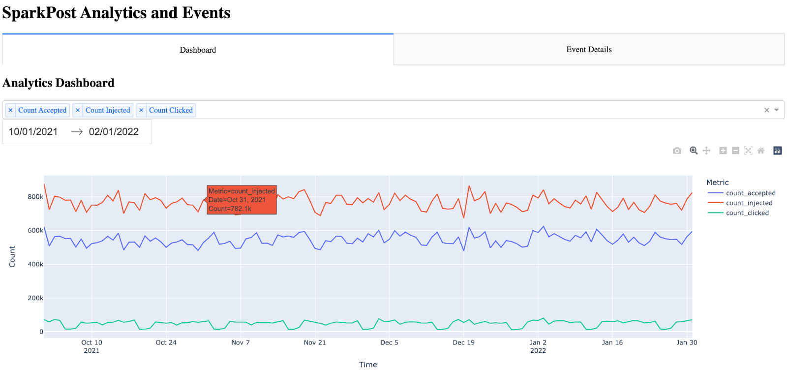
Hinweis: Viele Elemente sind automatisch in das Dash-Diagramm integriert (Hover, Zoom, automatische Skalierung).
Erstellen der Seite mit den Veranstaltungsdetails
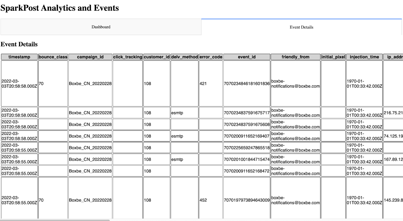
Die Seite mit den Ereignisdetails war etwas schwieriger, weil ich nicht wusste, wie ich alle Ereignismetriken am besten in einer leicht lesbaren Form darstellen sollte. Ich zog in Erwägung, dieser Seite Filterparameter hinzuzufügen, entschied jedoch, dass dies einen erheblichen Zeitaufwand für dieses Projekt bedeuten würde, da die Tabelle dann dynamisch sein müsste (zusammen mit dem Hinzufügen der Parameter, Callbacks usw.). Ich entschied mich dafür, alle Ereignisse anzuzeigen und den Zeitstempel an die erste Stelle zu setzen (da das Diagramm ohne den Zeitstempel an der ersten Stelle nicht leicht zu lesen war). Anfänglich fand ich, dass die Tabelle mit dem rohen HTML-Code unglaublich schwer zu lesen war. Es gab keine Ränder und keine Farbunterschiede zwischen Kopf und Zeilen. Um die Tabelle leichter lesbar zu machen, konnte ich CSS in Dash verwenden.
The idea for the event details is almost the same as the dashboard, except this time, I call the Ereignisse API and bring in all events. Note the event details only shows the 10 most recent events (utilizing the max_rows parameter and API filtering). This can be increased, however, I settled on showing the 10 most recent events because the more events have shown, the longer the API call takes. One significant improvement that could be made would be the ability to paginate and include a Next Page / Previous Page in the UI.
Um die Registerkarte "Ereignisse" (Seite) zu erstellen, rufe ich zunächst die Ereignis-API auf und parse die JSON-Antwort in einen Datenrahmen. Dann sortiere ich den Datenrahmen und ordne ihn neu an, um den Zeitstempel in die erste Spalte zu setzen. Schließlich baue ich die HTML-Tabelle durch Iteration durch den Datenrahmen auf.
#Build out and call the events API params = { "events" : "delivery,injection,bounce,delay,policy_rejection,out_of_band,open,click,generation_failure,generation_rejection,spam_complaint,list_unsubscribe,link_unsubscribe", "delimiter" : ",", "page" : "1", "per_page" : "10" } api_url = BASE_URL + "/events/message" response_API = requests.get(api_url, headers = {"Authorization" : API_KEY}, params=params) response_info = json.loads(response_API.text) new_df = pd.json_normalize(response_info, record_path=['results']) max_rows=10 #Max number of results show in the events table #Place timestamp as the first column in the table new_df = new_df.reindex(sorted(new_df.columns), axis=1) cols = ['timestamp'] new_df = new_df[cols + [c for c in new_df.columns if c not in cols]] #Show the new HTML with the events table (note, this table also references table.css) return html.Div([ html.H2("Event Details"), html.Table([ html.Thead( html.Tr([html.Th(col) for col in new_df.columns],className="table_css") ), html.Tbody([ html.Tr([ html.Td(new_df.iloc[i][col],className="table_css") for col in new_df.columns ]) for i in range(min(len(new_df), max_rows)) ]) ]) ])
In der Benutzeroberfläche sieht das so aus.
Nächste Schritte
Für jemanden, der sein eigenes Dashboard oder Ereignisprotokoll erstellen möchte, ist dies ein guter Anfang. Mit der Anpassungsfähigkeit hier sind dem Himmel keine Grenzen gesetzt.
Wie bereits erwähnt, könnten in Zukunft einige Verbesserungen vorgenommen werden:
Hinzufügen von Analysen zur Zustellbarkeit zum Dashboard
Hinzufügen weiterer Filter zum Dashboard
Mögliche Caching-Optionen, damit die API nicht jedes Mal aufgerufen werden muss, um die Seiten anzuzeigen
UI-Verbesserungen
Hinzufügen von Filtern und Paginierung auf der Seite mit den Ereignisdetails
I’d be interested in ein Feedback zu hören or suggestions for expanding this project.
~ Zach Samuels, Bird Senior Lösungen Engineer